
Scrolling Along the Information Highway
Imagine you’re reading a news article on the web. It’s formatted so that each paragraph is on a separate web page, so when you finish a paragraph you must click a <<read more>> link to continue reading. Now imagine that you’re reading a paragraph in which the author refers to information you read in a previous paragraph, but you don’t quite recall the point of that previous paragraph, nor do you remember where that paragraph is in the article. So you have to click back and forth between pages, scanning each for the information. Once you find it, you have to remember where you left off in the article in the first place. It’s a frustrating scenario—one that would make most of us just give up on reading the article in the first place. Now imagine that every web site and computer application is laid out like that—the only information you get at any one time is what fits on one screen. If you want more information, you have to load another page. If you forget where you are in the content, you must engage in a nearly mythical odyssey to find your way back. Unless the information is really worth the trouble, you might just turn back and forget all about the torturous voyage.
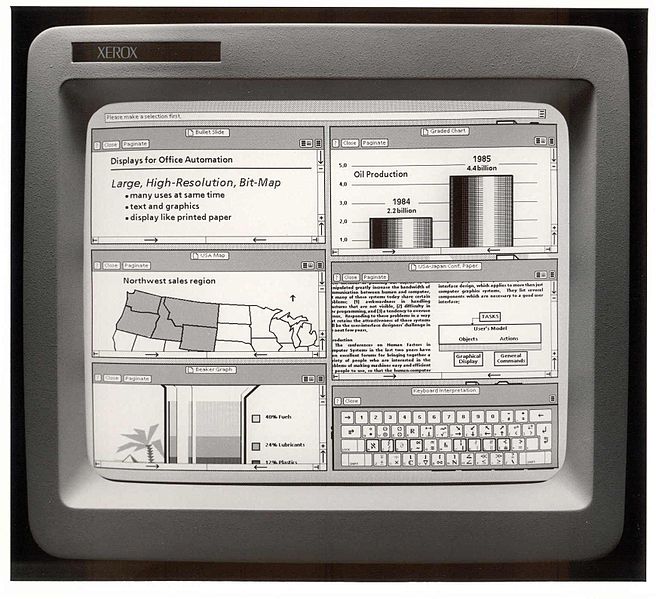
The scrollbar is a feature that is so useful we take it for granted, but it does have a history. Xerox pioneered it as part of its GUI in the ‘70s. Applying a user-friendly presentation layer to computing set the stage for the personal computing revolution that we’re still enjoying today. But how does it affect how we take in information from screens?
In the Information Age, there is one certainty: there is so much information. And hardly any of it fits neatly on one screen. Luckily, information doesn’t have to fit. It can take up all the space it needs, spilling over from one screen’s worth of territory to the vast murkiness of what lurks below, thanks to a clever bit of functionality that we all take for granted—window scrolling. Scrolling allows users to view content—be it web page, computer code, word doc, spreadsheet, music library, file directory, or anything else—that extends below the viewport (the visible portion of an application window). We scroll to learn more, to finish an article, to scan the important points of an office memo, and to check out our feeds and tweets.
Like pages in a printed book, scrolling adds a dimensional factor to screens. Printed pages give information a physical structure that readers use not only to remember where in the content a particular piece of information is located, but also to remember that information. Similarly, scrolling gives digital information a topographical quality. Users can monitor their place in the context of the whole window (not just what’s in the viewport) aided by the scrollbar. As it turns out, those dimensional structures are supremely important, not just to recall where you found a particular nugget of information, but also to recall that nugget at all (Rothkopf, 1971). Paged screens, where users have to wipe out one screen’s information to view that information’s continuation on a new screen, offer no such structure. For example, web pages are not like print pages at all. Clicking through multiple pages to read one article in its entirety risks wiping out those important mental structures rather than storing them.
Examples of Effective Scroll Strategies
Elle magazine's article, "The Graduate." A relatively uncluttered content space (the 'edit well') lets readers focus on the story without distraction. And even though the well is pretty focused, there's still plenty of room for advertising and links to additional content.
Multiple, brief concepts on one page—like The Daily Beast’s Cheat Sheet—also seem to work well. Notice the added 'Cheat Sheet' nav/progress bar, which might help reading retention and comprehension with a visual element that works to reinforce the close relationship between the page's information architecture and the reader's all-important mental information structure.
BuzzFeed's article, "Is Empty Nose Syndrome Real?" is about 6,000 words—quite long for one continuous page. But rather than break the page up, the site offers a distraction-free Reader View for deeper reading.
The Good
Efficient For Scanning Text
Scrolling uncouples content from length constraints, enabling providers to present information in its entirety on one page, and users to scan those whole concepts for specifically sought- or attention-grabbing information.
Less Distracting than Clicking
Serving one concept on one page, whether it’s a story, an article, or a gallery, is a tidy way of keeping self-contained information in one self-contained space. It also helps users retain focus.
The Bad
Scrolling has its limits
Long pages that require a lot of scrolling may be as risky as paging through many screens. Most research focuses on the cognitive differences between printed pages and screen pages, or the implications of scrolling on comprehension when reading is timed. However, that research does seem to indicate that scrolling does affect cognition, comprehension, and retention. So prudence in information length is still required. (If anyone has research on the implications of page length and scrolling to share, I’d love to see it.)
Infinite Scrolling is not Ideal
Keep in mind that fixity in the location of information on a page is important to the mental structures we create to store information. If content continues to load as the user scrolls down, that fixity is upended, and the mental structure is compromised. Fortunately, it appears to be a technique that is dying out.
Best PRactices
Taking lessons from the print world and from the growing data surrounding digital content, providers can develop strategies to help users with information retention and comprehension.
Optimize Text
Research suggests that the length of a line is an important consideration. Shorter lines (but not too short) mitigate the effects of the scrollbar by offering a fixed structure, but lines that are too short can lead to confusion as reader eyes journey from the end of one line to the beginning of the next (Dyson & Haselgrove, 2001).
Reduce Distraction
Images can illustrate important points, but they can also be distracting. Beymer, et al. (Beymer, Russell, & Orto, 2007) found that not just advertising images, but also images that illustrate points in a page’s content slow down reading. Likewise, motion animations and overlays are a distraction that could compromise focus.
Enable Deep Reading
There’s a big difference between reading for quick information and reading for deeper analysis (Adler, 1967; Baron, 2015; Wolf, 2007). If content lends itself to the latter, give users tools that fit the bill. Two common tools are Reader View and Printer-friendly formatting.
Scrolling is one of the biggest advantages screens offer in reading and taking in information. Understanding how its advantages and disadvantages to the user can help in structuring online content that enhances user experience.
References
Adler, M. J. (1967). How to read a book: the art of getting a liberal education. New York: Simon and Schuster.
Baron, N. S. (2015). Words Onscreen: The Fate of Reading in a Digital World. Oxford: Oxford University Press.
Beymer, D., Russell, D. M., & Orto, P. Z. (2007). An Eye Tracking Study of How Pictures Influence Online Reading. Interact 2007, 456 – 460.
Dyson, M., & Haselgrove, M. (2001). The influence of reading speed and line length on the effectiveness of reading from screen. International Journal of Human-Computer Studies, 54(4), 585–612. http://doi.org/10.1006/ijhc.2001.0458
Rothkopf, E. Z. (1971). Incidental memory for location of information in text. Journal of Verbal Learning and Verbal Behavior, 10(6), 608–613. http://doi.org/10.1016/S0022-5371(71)80066-X
Wolf, M. (2007). Proust and the Squid: The Story and Science of the Reading Brain. New York, NY: Harper.
Photo by Maya West from Portland, Oregon, USA, [CC BY-SA 2.0 (http://creativecommons.org/licenses/by-sa/2.0)], via Wikimedia Commons